/ LOGO DEVELOPMENT
Cyter Risk and Technology's logo objectives were a clean and simple design that was original and dynamic. The ability to seamlessly add new complimentary services without the need to rebrand, was also essential.
/ LOGO DEVELOPMENT
/ BUSINESS CARD DESIGN
AMK Interiors wanted to incorporate greens or blues along with watercolours and a contemporary script font for their logo. A balanced, whimsical look was achieved and we, according to the client, 'hit the nail on the head' with this one.
/ LOGO DEVELOPMENT
/ BUSINESS CARD DESIGN
/ VAN SIGNAGE
Ion Electrical wanted to get out into the marketplace with a very strong, professional brand identity. No cheesy electrical sparks for these guys.
/ LOGO DEVELOPMENT
/ BROCHURE
/ WEBSITE (SQUARESPACE)
Metrocloud Solutions had a vision for a bright, dynamic design that would roll out to all aspects of their business nicely. An uncomplicated, easily decipherable brochure and website, allow Metrocloud Solutions to inform their clients in the most straightforward way possible.
/ LOGO DEVELOPMENT
/ BROCHURE
/ WEBSITE (ROCKETSPARK)
/ LOGO DEVELOPEMENT
/ BUSINESS CARD DESIGN
/ SIGNAGE
Richard Pidgeon, an Auckland based Barrister, had a classical and professional vision for his branding.
/ LOGO DEVELOPMENT
/ BUSINESS CARD DESIGN
/ COLLATERAL
A fresh, clean and non fussy design for Point Tans and their brand identity.
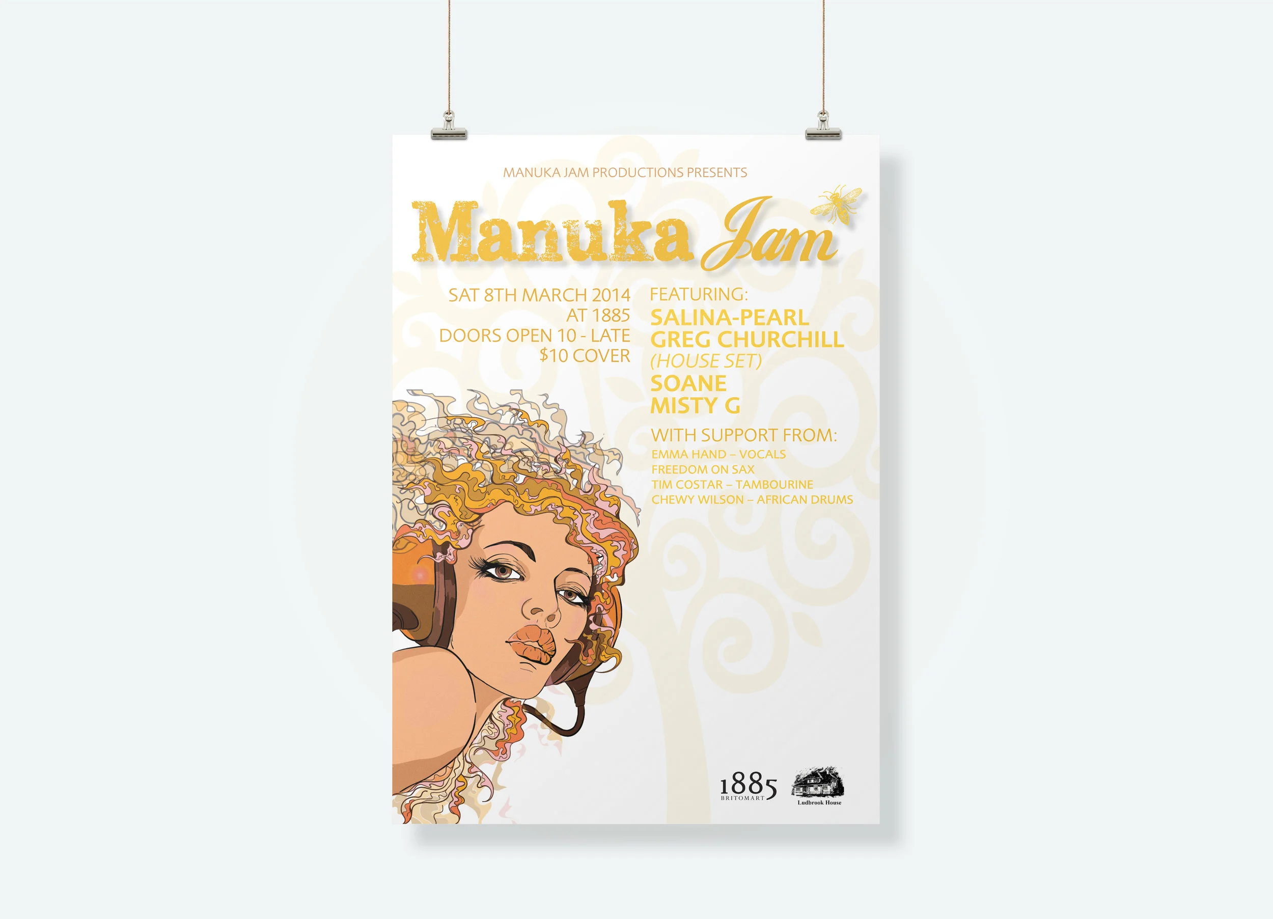
/ LOGO DEVELOPMENT
/ EVENT POSTERS
/ SOCIAL MEDIA FILE SETUP
Manuka Jam wanted a kiwiana feel to their brand identity. They were putting on a series of clubbing events that combined an exclusive selection of NZ DJ's and Musicians. The branding needed to be flexible and interchangeable.
/ LOGO DEVELOPMENT
/ EVENT POSTERS
/ SOCIAL MEDIA FILE SETUP
/ LOGO DEVELOPMENT
/ BUSINESS CARD DESIGN
/ MENUS
/ COLLATERAL
NikkeSushi an Australian based sushi eatery. Were after funky, clean and fresh branding.
/ LOGO DEVELOPMENT
/ BUSINESS CARD
/ VEHICLE SIGNAGE
/ WEBSITE (SQUARESPACE)
Metrocom Ltd, a telecommunications company, came to me for a revamp of their brand identity. There did not want a total rebrand but more of a freshen up of their current logo.
/ LOGO DEVELOPMENT
/ BUSINESS CARD DESIGN
/ FACEBOOK ADS
/ FLAGS
Shore Marine wanted a whole new rebrand to freshen up their image and marketing.
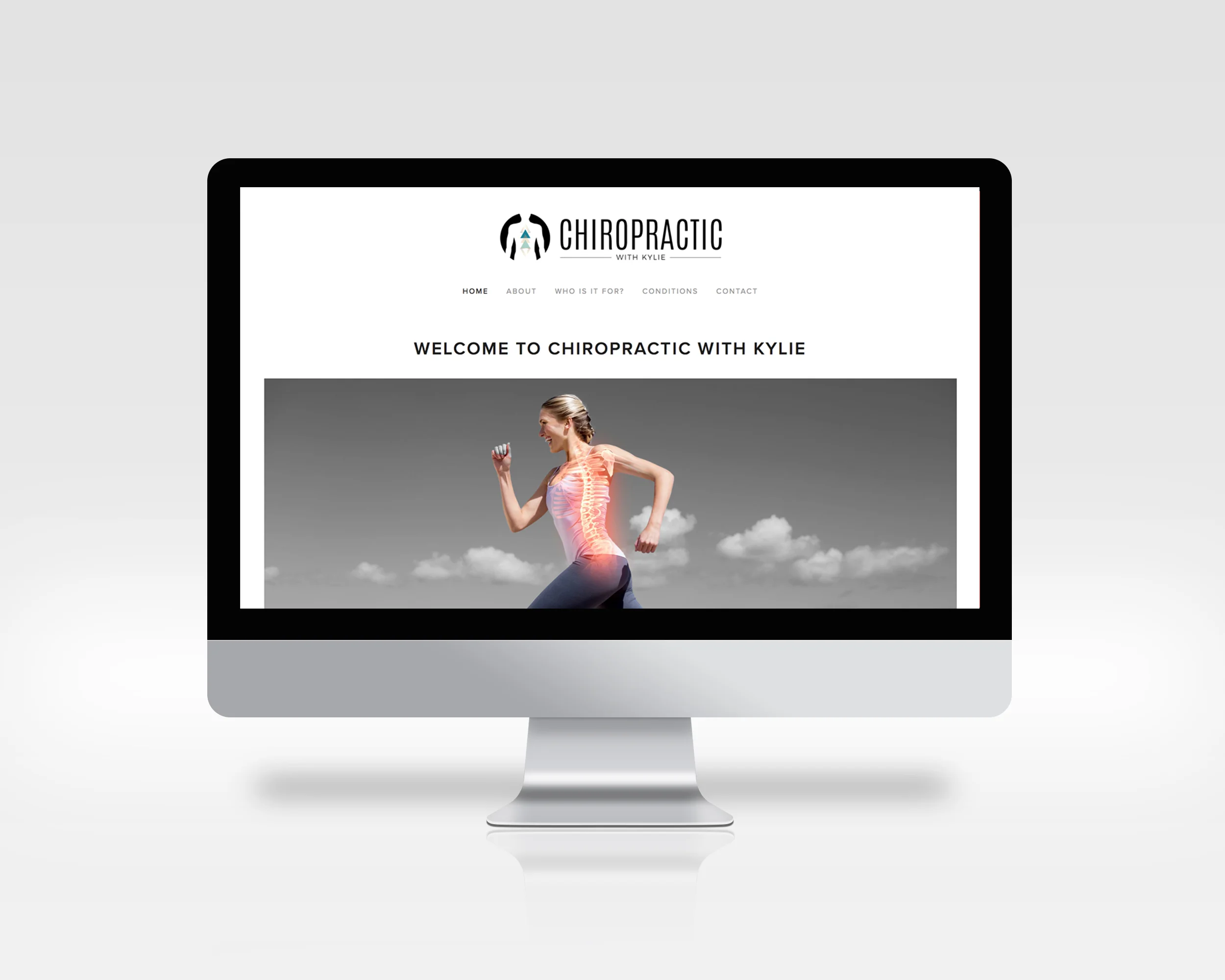
/ LOGO DEVELOPMENT
/ WEBSITE (SQUARESPACE)
Kylie was after a branding that would stand out from the classic chiropractic imagery. A logo that captured the essence of Chiropractics and was sophisticated and striking at the same time.